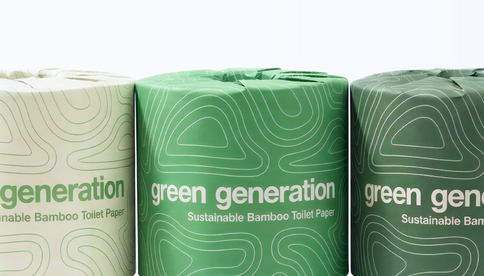
Color from the source
Soft sage, warm cream, and deep forest green echo bamboo itself and the landscape it grows in. The palette feels grounded because it's literally drawn from the ground.
Natural tones also age well, they won't look dated next year the way a trend color would.
Calm on purpose
Muted, earthy colors keep our products quiet in a room instead of shouting from the shelf. In a category addicted to bright packaging, restraint is the differentiator.
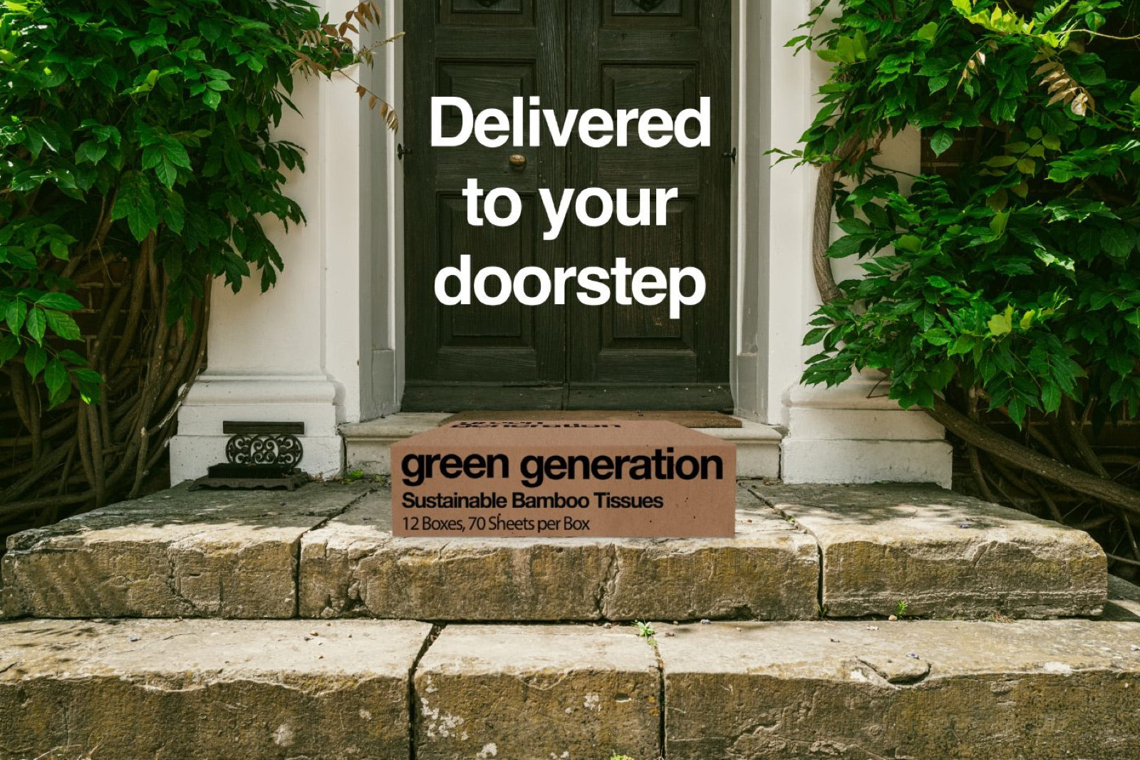
Consistent everywhere
From the kraft wrapper to this very page, the same disciplined palette runs throughout, so the brand feels like one calm, considered whole rather than a pile of parts.